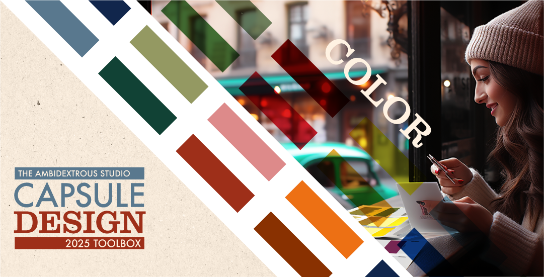
Color is one of the most expressive elements a designer can use to convey what the brand or project is all about. There are only 12 colors on the color wheel. However, when you consider the amount of possible mixtures, tints, and shades, there are millions of color choices.
It can be overwhelming. This guide will look to simplify the choices.
A quick caveat: if you are in the infancy stages of selecting the core color or colors for your overall brand or company logo, you should expand your options from this guide. In this instance, the psychology of colors, what feelings they convey, and how those relate to your brand should drive your color choices. A professional graphic or brand designer can assist in selecting colors that match your brand's desired perception.

The colors in this guide will work well for selecting secondary or complimentary colors to round out your brand's color palette. It also works well for crafting products, user interfaces, or any layout design that will co-mingle with pre-existing brand color guidelines.
Ambidextrous Studio Capsule Color Guide
Essential Colors

These colors are always in style. Most shades of black, white, and gray work with most accent colors in the color wheel.
Also, neutral tones like brown, beige, khaki, and taupe complement most colors.
These colors can be the lead actor (accent) or supporting actor (compliment) in a product or layout design. Also, multiple essential colors can work well in combination with each other.
Feel free to try as many of these colors as you please in your designs.
Neutrals

Neutrals are part of the Ambi capsule collection. They are colors that are not fully saturated or feel muted. Instead of red, think blush. Instead of forest green, think mint.
Neutrals are used extensively in fashion and interior design.
Brands and designers love neutrals for their organic, down-to-earth, and cozy feel. This makes them excellent complement colors for backgrounds or when working with a fully saturated accent color.
Grays

Grays are part of the essential and neutral color families. They are the go-to options when working with dominant accent colors.
Grays have an emotional range that is often under appreciated. Dark, warm tones like smoke or ash can feel strong, established, and reputable. Cooler tones like pearl or slate gray can feel relaxing, meditative, or reliable.
Adding the right tone of gray can help provide that sense of strength or stability your design is missing.
Accent Colors

These colors are much bolder and brighter. These accent colors want to take the lead.
The colors selected in the Ambi Studio accent samples remain in style, most of the time. They often feel contemporary in the right setting or when matched with the perfect complimentary tone.
Do I venture out of the accent colors selected? Most definitely. However, I find these colors resurface more than others in my projects.
These colors work well for headlines, call-to-actions, critical instructions (STOP!), or other areas you wish to draw attention to.
In addition, these are a great starting point when you feel the project needs some energy or boldness.
Pairings (Accent + Essential)
The capsule accent colors have a lot of personality. This means they may not play nice with other colors. However, they pair well with most capsule essentials and neutral colors.

These samples are just a few possible options. These pairings represent timeless combinations that are always feel en vogue.
Choose Wisely
Choosing the right colors can be an overwhelming task. I hope this guide can help you select colors represents your brand, amplifies your personality, and will look good 5 years from now.
In the next installment of Capsule Design, we will cover textures!


No Comments.